Reborn in Color
2018
Paris
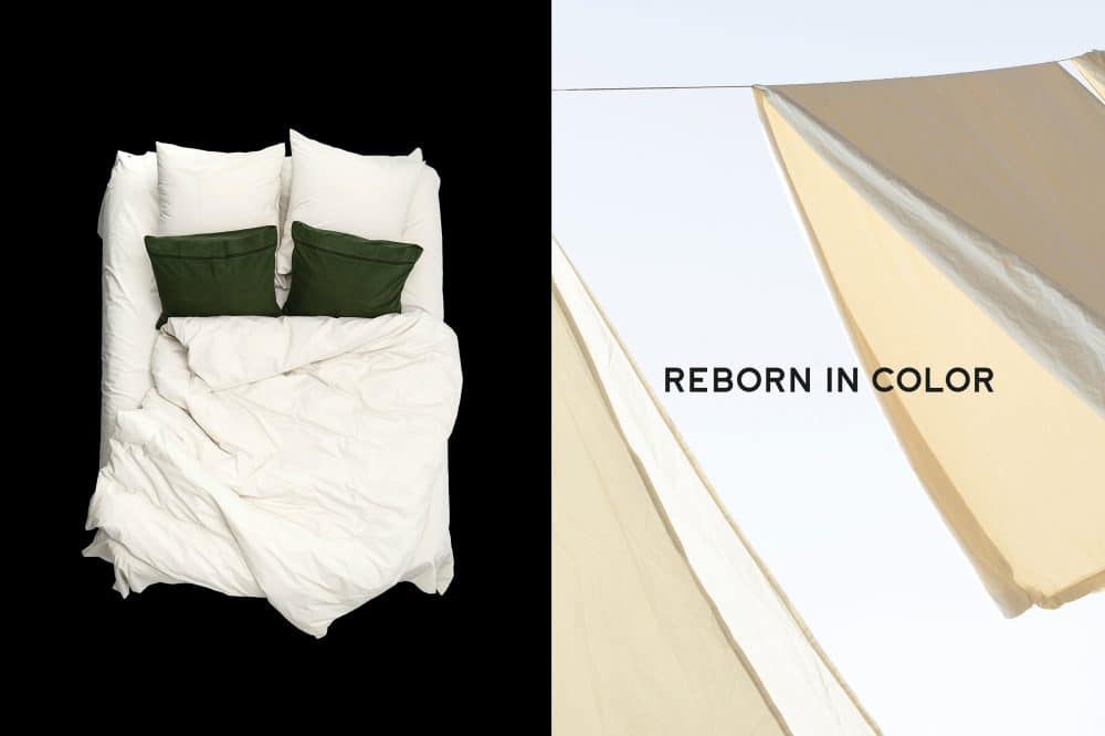
Visual identity and art direction for sustainable bed linen brand.
Reborn in Color was founded to create the highest quality bed linen, using the skill and quality found from past craftspeople to develop a lifelong product for the modern bed.
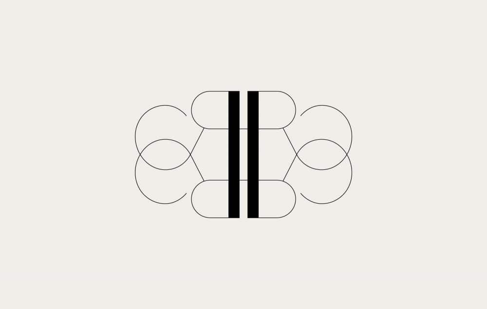
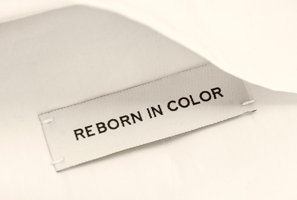
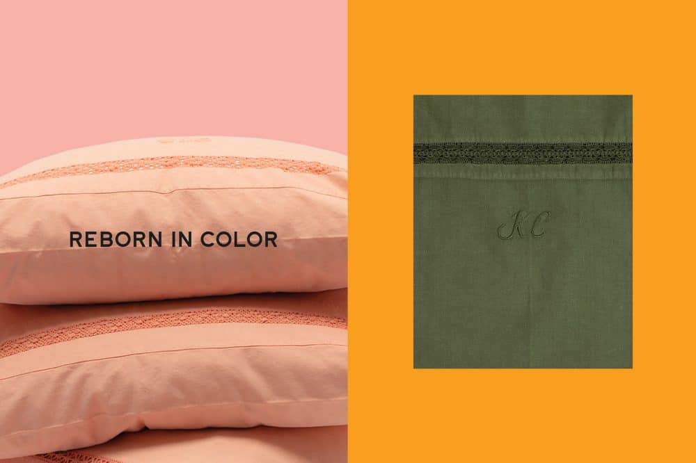
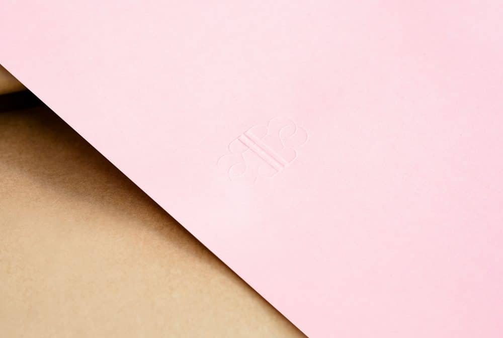
One part of the collection is up-cycled vintage products and the other newly produced organic cotton bed linen. The identity plays between heritage designs and a modern colour palette in order to create a hybrid. Inspired by traditional embroidered monograms found on linen, the logo took the form of an ornate letter ‘R’, which was mirrored left to right, and top to bottom, to creating an infinity symbol, which visually signals renewal, recycle and rebirth. The images on the webshop interact and overlay over the past image – nodding to the concept of overprinting. Just as Reborn in Colour’s products are sustainable, environmental impacts were factored into every stage of the identity design process.